Getting started
Meet Wisepops: your onsite marketing platform
Getting started with popups
Getting started with notifications
Onsite marketing performance benchmark and best practices
Navigating Wisepops Dashboard
App & features
Popups, sticky bars and embeds
Popups
How to create a popup for mobile
How to create a Popup: A Step-By-Step Guide
How to add a tab to your popup campaigns
Bars
Embeds
Campaign builder
Design
Create a multi-step campaign
Use a custom font in your campaign
Closing Options
Adding a Countdown Timer
Write Your Own CSS Rules into Your Popups
JS Callbacks
Introduction to JS Callbacks
After-popup-close Event
After-tracked-click Event
After-form-submit Event
Before-form-submit Event
Before-popup-display Event
Before-tab-display Event
Before-tracked-click Event
Scheduling your popup campaigns
Navigating the Popup Campaign Builder
A/B Testing
Campaign Management
Publish or Pause Campaigns
How to duplicate (and move a campaign)
Archiving, Deleting or Restoring campaigns
Integrations
ESP Integrations
Connect Wisepops with Splio
Connect Wisepops with Campaign Monitor
Connect Wisepops with Emarsys
Connect Wisepops with Ometria
Connect Wisepops with Optimizely Data Platform (ex Zaius)
Connect Wisepops with Marigold Engage (ex Selligent)
Connect Wisepops with Actito
Connect Wisepops with Acoustic
Connect Wisepops with Voyado
Connect Wisepops with Omnisend
Connect Wisepops with Constant Contact
Connect Wisepops with GetResponse
Connect Wisepops with SmartrMail
Connect Wisepops with Keap (formerly Infusionsoft)
Connect Wisepops with Drip
Connect Wisepops with MailChimp
Connect Wisepops with ActiveCampaign
Connect Wisepops with Sendlane
Connect Wisepops with Brevo (ex Sendinblue)
Connect Wisepops with Salesforce
Connect with Mailjet
Connect Wisepops with ConvertKit (through Zapier)
Sync your leads with Shopify
Connect Wisepops with HubSpot
Connect Wisepops with SendGrid
Integrating Wisepops with Klaviyo
Connect Wisepops with dotdigital
Connect Wisepops with Iterable
Connect Wisepops with Customer.io
Connect Wisepops with Intercom
Connect Wisepops with Pipedrive
Integrate Wisepops with your ESP using Zapier
Connect Wisepops with AWeber (through Zapier)
Connect with Close.io (through Zapier)
SMS Integrations
Connect Wisepops with Emotive
Connect Wisepops with Postscript
Integrate Wisepops with Attentive Using Zapier
Other integrations
Zapier
Send your leads to a Google Spreadsheet (using Zapier)
How can I take advantage of the Zapier integration?
Send a notification when an email is submitted (through Zapier)
API docs
Connect Wisepops with Yotpo SMS and Email
Notifications
Notification builder
Integrations
How to get better results with the notification feed?
Mastering Notifications: boost customer journeys with Wisepops
How to send push notifications
How to prioritize and pin a notification at the top of your Notification Feed
Excluding product
Display rules
Triggers
Target a Popup to Display on link or CTA Click
On scroll trigger
Target a Popup To Display on Hover
Adding a delay to your popup
Page targeting
Audience
Targeting new vs. returning visitors
Chrome’s Update and Its Impact on Source URL Targeting
Target by traffic channel, source or UTM parameters
Target a Specific Campaign
Target or Exclude a Specific Country, Region or City
Targeting campaigns to a specific language
Frequency
Advanced targeting
Set Custom Events to trigger popups
Using Custom Properties and Events for contextual targeting in Wisepops
Set up Custom Properties for Wisepops and use them to target your campaigns
How To Test Your Custom Properties
Shopify Built-In Properties
Use Google Tag Manager Variables as Custom Properties
Use Shopify Liquid Variables as Custom Properties
Set Custom Properties Based on Cookie Values
Default Custom Properties in Magento
How to target Klaviyo Segments in Wisepops
Use cases
Upsell & cross sell
Gamification
Create a Spin-the-Wheel Popup Without Collecting the User’s Email Address
Create a Spin-to-Win Campaign
Guidelines for writing game rules
How to Remove the Coupon Block from a Spin to Win Campaign
List growth
Create a Thank You Message (or Display a Coupon) After Sign-Up
Leverage 2-Tap SMS with Wisepops
Collect the URL on which the popup form is submitted
How to handle required merge fields
Add Custom Validation to Your Signup Forms
Add a product to the cart when a CTA is clicked (Shopify)
Collect the UTM parameters when a popup form is submitted
Adding more fields to your form
Select the dates available in your forms
Collect phone numbers / SMS opt-ins with Wisepops
How to pass Dynamic Variables into Hidden Fields
Send the data collected by a form to the redirected URL
How to grow your email list using the notification feed
Geo Targeting
Surveys
How to create a survey with Wisepops
Embed a SurveyMonkey Quiz Into a Popup
Display a form field conditionally
How to create an NPS survey popup
Embed a Typeform in Your Popup
Video
Promote discounts
How to create unique Shopify discount codes in your popups and notifications
Apply a Shopify discount code to the cart
How to use discount codes in Wisepops
Referral
Cart or site abandonment
How to create a cart recovery popup with Wisepops
How to create a cart recovery popup with Wisepops (Magento)
How to create a cart recovery popup with Wisepops (Shopify)
Creating a Post-Purchase Survey
Create an Exit Popup
How to create a lead magnet with Wisepops
Advanced use cases
Trigger a popup from the notification feed
Dynamically Add a Custom Parameter to a Redirect URL
Fire the Facebook/Meta Pixel When a form is Submitted
Forbid Disposable or Free Emails in Your Signup Form
Display a Popup Only After Another One Has Been Seen (or Clicked)
Personalize the Content of Your Popup or Notification on the Fly
Apply filters to your dynamic variables
Inject the Name of the Visitor's Company into Your Popups (with Clearbit)
Display the visitor's city within your popup
How to Target (or Exclude) Visitors Who Have Seen a Specific URL
How to retarget visitors who saw a specific page on your website
Display a Popup Based on an Alexa Rank Condition (With Clearbit)
Insert social widgets into your campaigns
Flag a Popup as Clicked With JS Code
Display a campaign when a product is added to the cart (Shopify)
Close a Popup With JS Code
Stop showing a notification after clicking on a popup
Analytics & Reporting
Goal Tracking
How to setup Goal Tracking for Wisepops
How to Set Up Goal Tracking in Magento
How to set up Goal Tracking using Google Tag Manager
Google Analytics
Introduction to the Google Analytics integration
Send Wisepops events to GA4 using GTM
Track clicks on your links using Google Analytics
How to use the Wisepops events in Google Analytics
Disable Wisepops on my device
How to Filter Out Internal Traffic
Better understand your Notification analytics
How to track clicks in custom HTML blocks
Time zone used for reporting
Exporting your data
Analytics: Understanding how your campaigns perform
How to track signups with a tracking pixel
Exclude your device
Account & Setup
Install the Wisepops tracking code
CMS integrations
Installing Wisepops on your website via Google Tag Manager (GTM)
Add Wisepops to Zoey
Add Wisepops to Webflow
Add Wisepops to Instapage
Add Wisepops to Blogger
Check your code implementation using Mozilla Firefox
Add Wisepops to Big Cartel
Add Wisepops to Drupal 8
Add Wisepops to BigCommerce
Add Wisepops to Umbraco
Add Wisepops to Joomla
Add Wisepops to Squarespace
Add Wisepops to Magento 2
Add Wisepops to Google Sites
Add Wisepops to Cratejoy
Add Wisepops to 3dcart
Add Wisepops to Prestashop
Add Wisepops to Shopify
Add Wisepops to Weebly
Integrate Wisepops with Segment.com
How to add Wisepops to a custom website?
Add Wisepops to Wordpress/WooCommerce
How to add Wisepops to a Wix website
Add Wisepops to Volusion
Add Wisepops to SiteBuilder
Add Wisepops to Drupal 7
Add Wisepops to Neto
Wisepops on Single-Page Applications
Add Wisepops to Mono
Add Wisepops to Opencart
Integrating Wisepops with your website
Check your code implementation using Google Chrome
Adding the notification feed to your website
Custom Setup Guides for Shopify Themes
Minimal Theme
Dawn theme
Narrative Theme
Debut Theme
Simple Theme
Express Theme
Venture Theme
Brooklyn Theme
Boundless Theme
Supply Theme
Adding the notification feed to your website
Customize your Notifications Feed with Advanced Feed Customization
Add the notification feed with Shopify
Hide the bell until the notifications are loaded
Billing
🔗 Integrations with your tools
Add/Delete Website
Add, edit or delete users and manage permissions
Use Distinct Websites for Staging and Production
Enabling Right-to-Left Language Support
Uninstall Wisepops from your Shopify website
How to I remove the notification feed from my site
Can I use Wisepops on multiple domains?
Security & Compliance
Legal
GDPR & CCPA compliance
Configure the Wisepops cookies lifetime
Accessibility and compliance with ADA/WCAG
Information concerning cookies
GDPR Compliance for Sign-Up Forms
Compliance with Shopify's Customer Privacy
Security
FAQ
Preview/test your campaign on a hidden URL
Popup Design FAQ
Will Wisepops slow down my website?
Exclude Your Existing Subscribers
Is Wisepops compatible with my mobile app?
Can I show more than one popup on the same page?
Troubleshooting
How to fix email synchronization issues
Troubleshooting: Why isn't my campaign appearing?
Tips for effectively reporting an issue
Troubleshooting: Dealing with Ad Blockers and VPNs
Collected emails don't appear on my dashboard
Why does my popup look broken?
My emails are not collected in Mailchimp
My Popup is Locked!
Why does my popup appear for a few seconds and disappear?
Supply Theme

Supply Theme
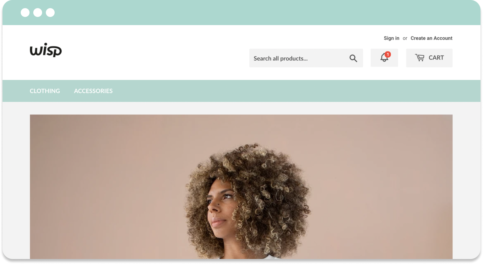
These instructions will guide you through a custom setup of the Feed on the Shopify theme called Supply. The result will look like the images below. As you'll see, the bell is embedded into the header, giving it a more native feel.
To achieve this, you need to edit your theme's code. We recommend making a copy of your live theme, and modifying it. Then when you're happy, you can set it live.
When ready, open the code editor for the Supply theme copy you want to edit, then follow these instructions.
Step 1: Open the file header.liquid. You can find it in the folder called 'sections'.
Step 2: Around line 46, look for:
<div class="grid-item large--one-half text-center large--text-right">
Replace the class one-half with the class two-thirds. This will ensure that the search bar, Wisp bell and cart always remain on the same line when visible.
Step 3: Now around line 78, find {% include 'search-bar' %}. Insert the following snippet on a new line immediately after it:
<a tabindex="0" role="button" aria-label="Notifications" href="#" class="wisp icon header-cart-btn">
	<svg fill="none" stroke-linecap="round" stroke-linejoin="round" stroke-width="2" width="25" height="25" viewBox="0 0 24 24" stroke="currentColor" xmlns="<http://www.w3.org/2000/svg>">
		<path d="M15 17h5l-1.405-1.405A2.032 2.032 0 0118 14.158V11a6.002 6.002 0 00-4-5.659V5a2 2 0 10-4 0v.341C7.67 6.165 6 8.388 6 11v3.159c0 .538-.214 1.055-.595 1.436L4 17h5m6 0v1a3 3 0 11-6 0v-1m6 0H9"></path>
  	</svg>
</a>
Step 4: Look for the following lines of code around lines 96-98. Make sure it contains class="icon icon-hamburger" so you know that you've found the right spot.
<div class="display-table-cell">
    <button class="menu-toggle mobileNavBar-link" aria-controls="navBar" aria-expanded="false"><span class="icon icon-hamburger" aria-hidden="true"></span>{{ 'layout.navigation.mobile_menu' | t }}</button>
  </div>
On a new line immediately after the final </div> of the example above, insert the following snippet:
<div class="display-table-cell">
    <a tabindex="0" role="button" aria-label="Notifications" href="#" class="wisp mobileNavBar-link">
    	<svg fill="none" stroke-linecap="round" stroke-linejoin="round" stroke-width="2" width="22" height="22" viewBox="0 0 24 24" stroke="currentColor" xmlns="<http://www.w3.org/2000/svg>">
        	<path d="M15 17h5l-1.405-1.405A2.032 2.032 0 0118 14.158V11a6.002 6.002 0 00-4-5.659V5a2 2 0 10-4 0v.341C7.67 6.165 6 8.388 6 11v3.159c0 .538-.214 1.055-.595 1.436L4 17h5m6 0v1a3 3 0 11-6 0v-1m6 0H9"></path>
    	</svg>
	</a>
</div>
Step 5: Go to the end of the file and find {% schema %}. On a new line immediately before it, add the following:
<style>
  .wisp svg {
    vertical-align: middle;
    display: block;
    margin: auto;
  }
</style>
Step 6: Save your changes to the file.
Step 7: Next, open the file theme.scss.liquid. You can find it in the folder called 'assets'.
Step 8: Around line 3085, locate the class .search-bar. Adjust it's property max-width: 60%; down to .max-width: 47%;.
Step 9: Save your changes to the file.
Step 10: Switch the feed from 'floating' to 'custom' in the Admin and send a trial notification. It may take some time for the change to take effect, but when you can see the notification in the theme preview, it's ready to be published.
If the notification badge (red dot) isn't appearing in the proper spot relative to the bell, reach out to our team. This is something that has we will have to adjust for you.